VistaPrint: Streamlining an E-Commerce Checkout Flow
Overview:
Vistaprint’s checkout process guides users through multiple sequential pages after adding a product to cart. While functional, the experience fragments decision-making across screens and limits user orientation during a high-commitment moment.
This project focused on reducing cognitive load and improving user confidence by simplifying the post-cart checkout flow through three targeted UX improvements: orientation, action clarity, and user control.
The Problem:
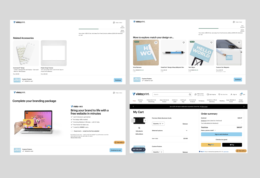
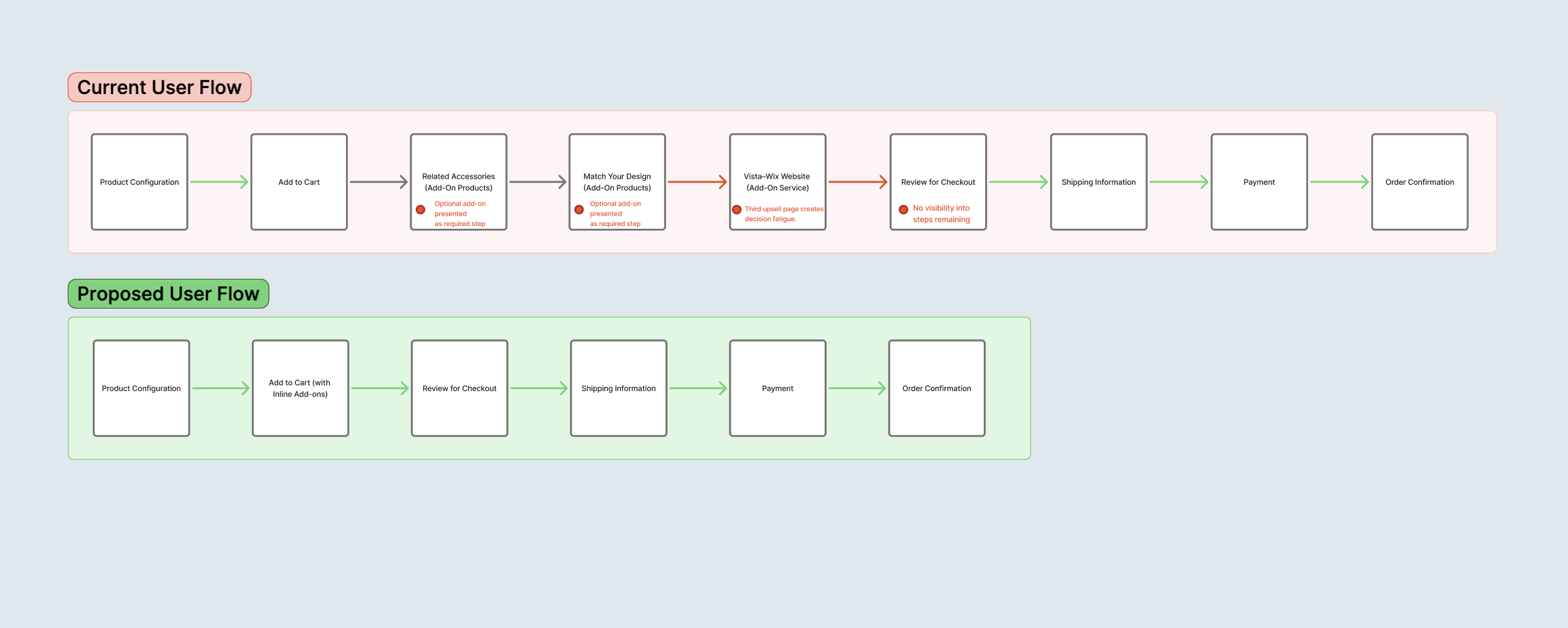
After adding a configured product to cart, users are directed through three additional pages before completing checkout.
During this process:
Progress through checkout is not clearly communicated
CTA language lacks specificity
Backward navigation is limited
Users must rely on browser navigation to revisit earlier steps
These issues increase uncertainty at a critical conversion point, potentially contributing to hesitation or abandonment.
Role: UX Designer
Goals:
Improve visibility into checkout progress
Reduce ambiguity around next actions
Restore user control during multi-step navigation
Decrease perceived effort during completion
UX Audit Findings
1. Lack of Progress Visibility
Users move through pages without a clear understanding of how many steps remain.
2. Ambiguous Call-to-Action Language
The generic “Continue” button does not communicate what action occurs next in the earlier steps of the checkout process.
3. Limited Backward Navigation
Users cannot easily revisit previous steps without relying on browser controls.
Collaboration & Alignment
Although the scope of this project focused on targeted UX improvements, successful implementation would require close collaboration across teams.
I aligned with:
Product stakeholders to clarify business priorities and ensure changes supported conversion goals.
Engineering partners to evaluate feasibility of adding persistent navigation elements and maintaining state across steps.
Marketing and content teams to refine microcopy and ensure tone remained consistent with brand standards.
Design decisions were shared through annotated wireframes and flow diagrams, allowing for early feedback and alignment before moving into higher-fidelity designs.
By incorporating technical and business considerations alongside user needs, the redesign balanced usability improvements with implementation practicality.
Redesign Strategy
Rather than rebuilding the entire checkout system, the redesign focused on four targeted improvements to reduce friction, increase clarity, and support conversion.
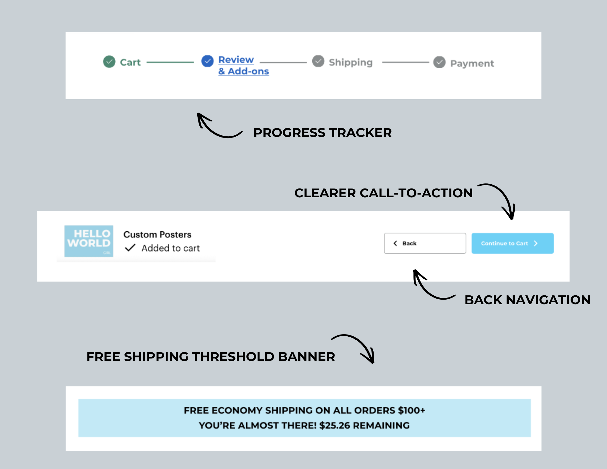
1. Progress Tracker
Problem: Users could not clearly see where they were in the checkout process.
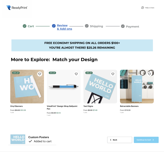
Solution: A structured progress tracker was added across checkout pages to show completed, current, and upcoming steps.
Impact: This improves orientation, reduces uncertainty, and makes the process feel more manageable.
2. Clearer Call-to-Action
Problem: The generic “Continue” button created ambiguity about the next step.
Solution: The button was updated to “Continue to Cart” to clearly communicate what happens next.
Impact: Clear action language reduces hesitation and supports smoother progression through checkout.
3. Back Navigation
Problem: Users could not easily return to previous steps without restarting or using browser controls.
Solution: A visible back button was introduced to allow users to revisit earlier steps without losing their progress.
Impact: Restoring user control reduces frustration and increases confidence during checkout.
4. Free Shipping Threshold Visibility
Problem: Users were not clearly informed how close they were to qualifying for free shipping, limiting transparency around potential cost savings.
Solution: A dynamic banner was added to display the free shipping threshold and the remaining amount needed to qualify (e.g., “You’re almost there: $25.26 remaining”).
Impact: Making this incentive visible increases pricing transparency and can encourage incremental purchases without interrupting the checkout flow.
Results & Outcomes
While this redesign was conceptual, the improvements were designed to:
Reduce perceived complexity
Improve flow confidence
Strengthen transparency
Support higher checkout completion rates
By focusing on orientation, clarity, and control, the checkout process becomes more predictable and user-centered without requiring a full structural overhaul.
Reflection
This project demonstrates how small, intentional UX decisions can meaningfully reduce friction within high-stakes user flows. By addressing structural clarity rather than visual polish alone, the redesign improves both usability and conversion confidence.
Learnings:
While these steps were effective in streamlining the process and user flow, we found that implementing the progress tracker was not as effective as we had hoped in improving the user experience and that there are still too many steps in the process with all of the add on pages for this to be deemed effective.
Recommendations
Given the scale and complexity of a platform like Vistaprint, larger structural changes would require cross-functional alignment and phased implementation. While this project focused on targeted improvements, several additional opportunities could further streamline the checkout experience.
1. Consolidate Add-On Experiences
The current flow distributes add-ons across multiple pages, including “Match Your Design” and the Vista–Wix website integration. In a future iteration, these could be consolidated into a single structured add-on stage or integrated within the review page as clearly optional enhancements.
This would:
Reduce perceived steps
Minimize decision fatigue
Create clearer separation between required actions and optional upgrades
2. Further Reduce Checkout Steps
Beyond consolidation, the overall checkout could be simplified by merging transitional pages and focusing the flow around core user milestones: Review, Shipping, Payment, and Confirmation.
This would reinforce clarity while maintaining revenue-driving opportunities in a more user-centered structure.